High-Converting Email Templates: Where Design Meets Data
The Template Is the Product
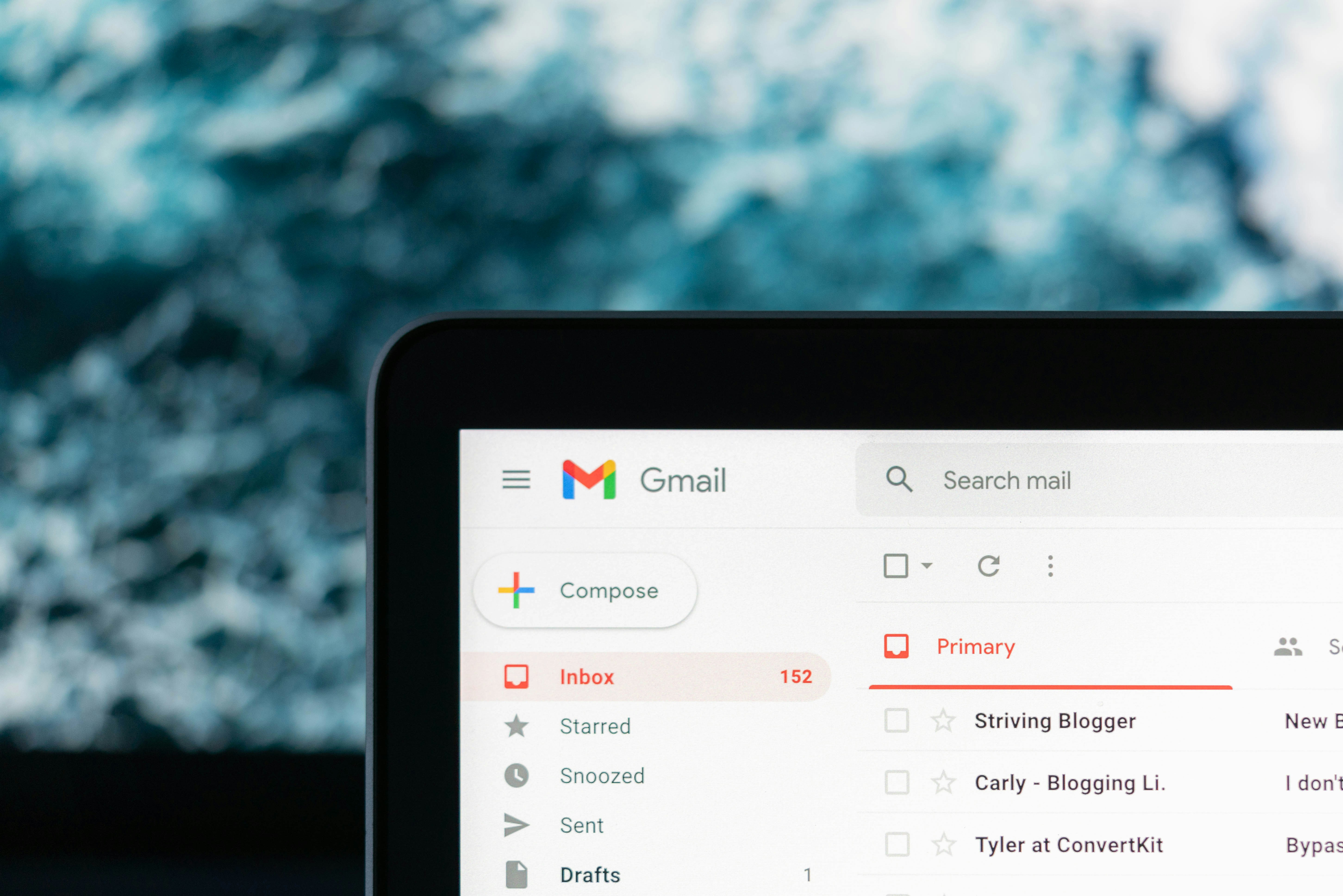
In email marketing, your template is not just a container for your message—it is the first judgment your reader makes about whether your message deserves their attention. In the three seconds before a reader decides to engage or delete, template design is doing more persuasive work than your copy.
Yet most marketing teams treat templates as a solved problem. They pick a layout from a library, paste in content, and send. This approach leaves enormous conversion potential on the table. The difference between a mediocre template and a high-converting one isn't aesthetic preference—it's a measurable performance gap that compounds with every campaign you run.
In 2026, the bar for email template quality has risen significantly. Readers now check email across a wider range of devices, operating systems, and display settings than ever before. Dark mode is enabled on over 60% of mobile devices. Screen reader usage is growing. Rendering environments vary wildly across the 40+ email clients in common use. Templates that don't account for this complexity don't just look bad—they fail silently, costing you clicks and conversions without obvious explanation.
This guide covers the design and data principles behind templates that perform: mobile-first architecture, dynamic content blocks, accessibility requirements, dark mode compatibility, and the performance benchmarks that tell you which template types work hardest for which use cases.
Mobile-First Is Not a Trend—It's a Baseline
As of 2026, approximately 68% of commercial emails are opened on mobile devices. Mobile-first design means starting with the constraints of the smallest screen and expanding outward—not designing for desktop and hoping the mobile version works.
The Principles of Mobile-First Email Layout
Mobile-first email templates share a common set of structural characteristics:
- Single-column layout: Multi-column layouts require media queries and conditional rendering that breaks inconsistently across email clients. A well-executed single-column layout is more readable on mobile and degrades gracefully on desktop.
- Minimum 14px body font size: Below 14px, text is illegible on standard mobile screens without zooming. Many email clients override smaller fonts anyway; design for readability from the start.
- Touch-friendly CTA buttons: Apple's Human Interface Guidelines recommend a minimum tap target of 44x44 pixels. Buttons that are too small frustrate mobile users and reduce click-through rates measurably.
- Preheader text optimized for mobile: The preheader is the second most-read element in an email inbox after the subject line. On mobile, it's often the deciding factor. Keep it under 90 characters and make it a genuine extension of the subject line—not a repeated instruction to “view in browser.”
- Images with meaningful alt text: Many mobile users read email on cellular connections with images disabled. Alt text that describes the image's function (not just its content) keeps your message coherent when images don't load.
Hero Image Sizing and Load Performance
Oversized hero images are the most common template performance killer. A 2MB header image delays render time on mobile connections, and many email clients clip messages over a certain file size entirely. Keep hero images under 200KB where possible. Use modern formats where client support allows, and always test render speed on a throttled mobile connection before sending to your full list.
Dynamic Content Blocks: One Template, Many Conversations
The era of one-size-fits-all templates is over. The most powerful capability available in modern email marketing is dynamic content: the ability to swap entire sections of a template based on subscriber data, behavior, or context—while maintaining a single production workflow.
What Dynamic Blocks Can Do
MailerBit's template editor supports dynamic content blocks that can be configured to show or hide based on virtually any subscriber attribute or behavioral trigger:
- Demographic personalization: Show different product recommendations to different age groups. Display region-specific pricing or offers. Adapt imagery to reflect subscriber location or language preference.
- Behavioral personalization: Show a re-engagement block to subscribers who haven't clicked in 60 days. Surface the specific product category a subscriber last browsed. Display loyalty tier benefits to members who are close to the next reward threshold.
- Lifecycle-stage personalization: New subscribers receive onboarding content. Active subscribers receive product updates and upsell opportunities. Lapsed subscribers receive win-back offers. Same template, completely different experience depending on where the subscriber is in the customer journey.
Designing Blocks for Interoperability
The key constraint with dynamic blocks is that each variant must work visually across all the template positions it might occupy. Design your dynamic blocks as modular units: consistent padding, flexible image aspect ratios, and text that works at variable lengths. A product recommendation block designed for a 30-character product name will break visually when populated with a 60-character name.
Build a block library in MailerBit's editor that covers your core use cases—product recommendation, event promotion, testimonial, re-engagement, educational content—and test each variant in isolation before deploying it within a full template.
Accessibility and Dark Mode: The Invisible Conversion Factors
Accessibility and dark mode compatibility are treated as optional extras by most email teams. They are not optional—they are the difference between reaching your full addressable audience and systematically excluding a significant portion of it.
Building for Accessibility
Email accessibility standards (WCAG 2.1 AA as applied to email) require:
- Sufficient color contrast: A minimum contrast ratio of 4.5:1 for body text against background. Tools like the WebAIM Contrast Checker make verification straightforward. Low-contrast text is unreadable for the estimated 300 million people worldwide with color vision deficiency.
- Semantic HTML structure: Proper heading hierarchy (h1, h2, h3 in logical order), paragraph tags for text, and list elements for list content. Screen readers rely on semantic structure to present email content meaningfully.
- Descriptive link text: “Click here” is meaningless to a screen reader user navigating by link list. “Download the 2026 Email Benchmark Report” is fully descriptive and improves usability for all readers.
- Role and lang attributes: Adding lang="en" to your HTML tag and role="presentation" to layout tables prevents screen readers from announcing structural markup as content.
Dark Mode Compatibility
Dark mode inverts or modifies color rendering in ways that break most templates designed only for light backgrounds. Common failures include:
- White text on transparent background becoming invisible on white dark-mode override
- Dark logos and icons disappearing against dark backgrounds
- Brand color buttons rendered in unexpected colors due to dark mode overrides
The solutions are well-established: use @media (prefers-color-scheme: dark) queries in your embedded CSS, provide dark-mode variants of logos with light fills, add subtle visible borders to elements that need to maintain contrast, and test in Gmail on both iOS and Android in dark mode before every major send.
MailerBit's template editor includes a dark mode preview toggle that renders your template under dark mode conditions in real time, eliminating the need for external testing tools for most common use cases.
Performance Metrics by Template Type
Not all templates convert equally, and not all template types are suited to all use cases. Benchmark data from 2026 email performance studies reveals consistent performance patterns across template categories:
Promotional Templates
High-contrast design with a single dominant CTA performs best for promotional sends. Average CTR: 3.8–5.2%. Key variables: hero image quality, CTA button color contrast against background, and the ratio of offer clarity to design complexity. Simpler templates consistently outperform complex ones when the offer is strong.
Transactional Templates
Clean, minimal templates with clear information hierarchy dominate transactional email. Average open rate: 45–65% (contextual, not engagement-driven). The priority is information retrieval speed—confirmation numbers, order details, and next steps should be visible within two seconds of opening. Template design should get out of the way of information delivery.
Nurturing and Educational Templates
Long-form content templates with strong typographic hierarchy and supporting visuals outperform design-heavy templates for nurturing sequences. Readers engaging with educational content are in a reading mindset—give them clean, readable layout with generous white space and clear section hierarchy. Average session time (from click to conversion) is 40% longer on content-optimized templates than promotional templates.
Re-Engagement Templates
Re-engagement templates perform best when they're visually different from your standard sends—a change in layout, color scheme, or format signals to the reader that something different is being offered. Direct subject lines that name the gap (“We haven't heard from you in a while”) outperform indirect approaches. Single-CTA templates with minimal copy get the highest click rates in this category.
The template that converts best is the one built on both design intelligence and performance evidence. MailerBit's template editor gives you the tools to build with both: drag-and-drop simplicity, dynamic content block configuration, dark mode preview, and A/B testing built into the campaign workflow. Start with the principles. Test against your audience. Iterate without sentiment. That's how high-converting templates get made—and stay high-converting as audience behavior evolves.